
Background
Content strategy + website redesign
firepowercaptial.com
Completed September 2017
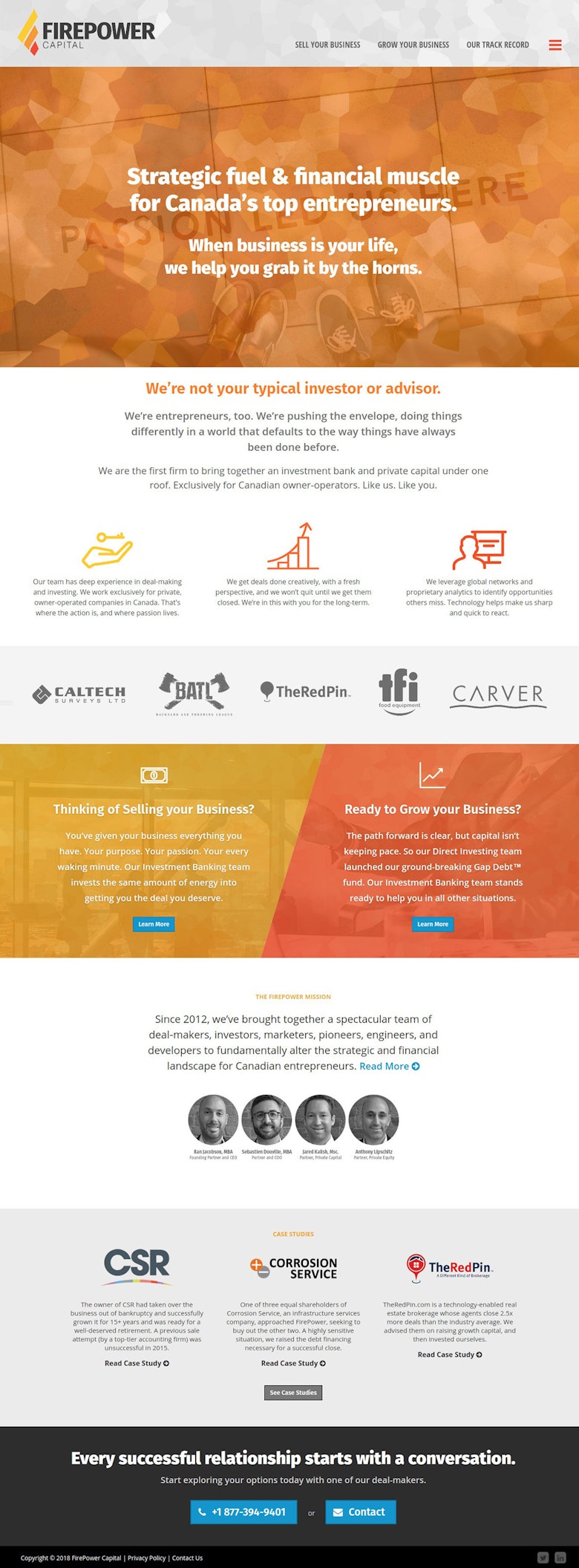
A rapidly growing investment bank and private equity firm, FirePower was struggling to keep their website image inline with their brand as they grew.
Multiple attempts had been made to launch a new website, but each one lasted no more than a year before being scrapped & redesigned.
How it went
Our first challege with FirePower was understanding their business model. They’re a bit a quirk in the world of investment banks – a new breed they would say.
Most firms will invest their own money in a business or help find investors for a business – FirePower does both.
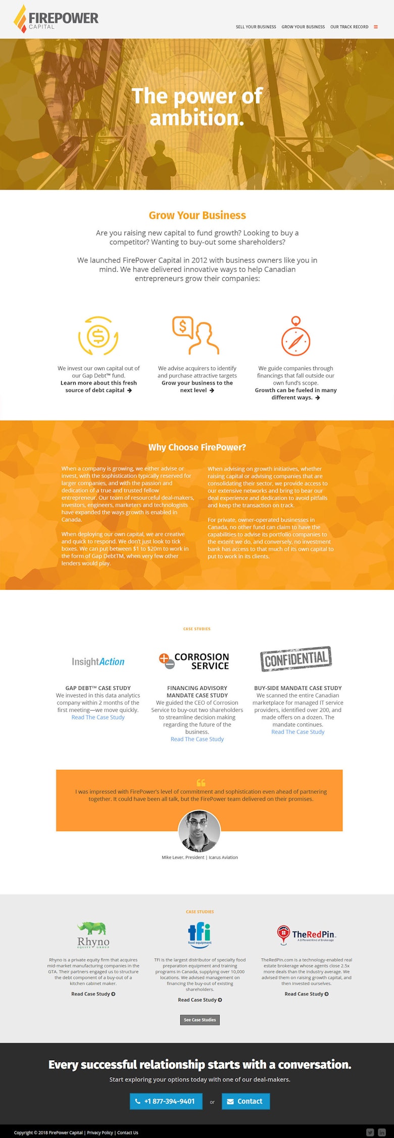
At the end of the day though, they primarily help business owners who are looking to sell their business or expand their business, so that’s how we tackled their website.

Content strategy + website redesign
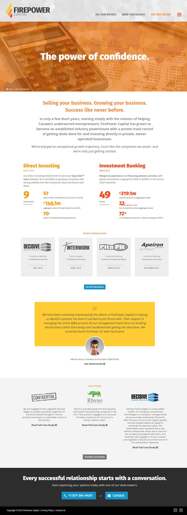
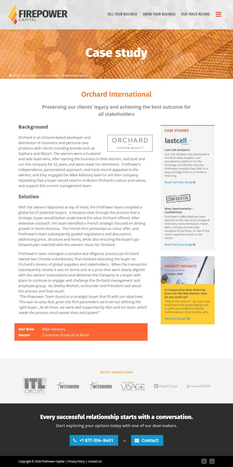
We aggressively pushed a user-focused agenda to help get them in the frame of mind to speak to their customers instead of “speaking finance”.
Redesigned the information architecture & rewrote the content in a voice that spoke to their audience.


Performance Improvements
We quickly identified the load speed of their previous site to be a major red flag leading to a poor user experience.
We moved them to a more appropriate hosting company and made sure the new site was tuned to load quickly.
In the end, we cut page load times from 5 – 6 seconds down to under 0.7 seconds, which ultimately helped lead to an immediate increase in monthly visitors and leads generated through the site.
Simplicate pushed us to talk to our audience instead of about ourselves.
Sounds obvious, but in the investment banking and private equity industry, it was not. Rarely has our team been challenged that creatively and productively by a consultant, website or otherwise.
That process helped us to break the cycle of redeveloping our website every year, and ensured our content and messaging made prospective clients comfortable that we were the right choice to work with even before picking up the phone to speak with us for the first time.
Simplicate also redesigned our logo to capture the energy of our brand and we’ve received numerous compliments on it, as well as the website, from a wide range of people in our traditionally conservative industry.
3 years later…
FirePower has been able to manage and maintain more of their content than ever before. The business continues to grow, and they’ve even opened a second office in Montréal.
The cycle of redesigning their site every year has been broken and we routinely work with them on minor incremental improvements to the site rather than starting everything all over again from scratch.
More projects?
We’ve built our reputation helping clients launch websites of all shapes and sizes. We'd love to get started with you!
